ตัวอย่าง css เกี่ยวกับรูปภาพ
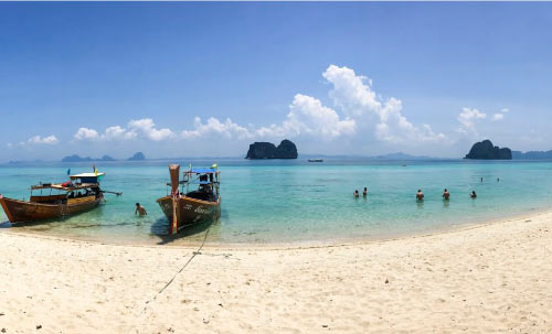
shadow
<style>
.sha {
    box-shadow:
        10px 10px 10px 5px #ccc;
		#x offset, y offset, blur size, spread size, color
}
</style>
<img class="sha" src="/img/html/bootstrap-pic/MzHy4.jpg" width="200">
<br><br>
radius
<style>
.radius {
	border-radius: 10px;
}

.radius2 {

	border-radius: 20px 2px;
}
</style>
<img class="radius" src="/img/html/bootstrap-pic/MzHy4.jpg" width="200">
<img class="radius2" src="/img/html/bootstrap-pic/MzHy4.jpg" width="200">
border
border<br>
<style>
.border {
	border-style: solid;
	border-width: 4px;
	border-color: #DDD;
}
</style>
<img class="border" src="/img/html/bootstrap-pic/MzHy4.jpg" width="200">
border
gray
gray<br>
<style>
.gray50 {
	filter: grayscale(50%) opacity(80%);
}
.gray100 {
	filter: grayscale(100%);
}
</style>
<img class="gray50" src="/img/html/bootstrap-pic/MzHy4.jpg" width="200">
<img class="gray100" src="/img/html/bootstrap-pic/MzHy4.jpg" width="200">
gray
invert
invert<br>
<style>
.inverted {
	filter: invert(100%);
}
</style>
<img class="inverted" src="/img/html/bootstrap-pic/MzHy4.jpg" width="200">
invert
brightness
brightness<br>
<style>
.brightness80 {
    filter: brightness(80%);
}
.brightness120 {
    filter: brightness(120%);
}
</style>
<img class="brightness80" src="/img/html/bootstrap-pic/MzHy4.jpg" width="200">
<img class="brightness120" src="/img/html/bootstrap-pic/MzHy4.jpg" width="200">
brightness
blur
blur<br>
<style>
.blur {
    filter: blur(0.1em); /*or px*/
}
</style>
<img class="blur" src="/img/html/bootstrap-pic/MzHy4.jpg" width="200">
blur
contrast
contrast<br>
<style>
.contrast {
    filter: contrast(120%);
}
</style>
<img class="contrast" src="/img/html/bootstrap-pic/MzHy4.jpg" width="200">
contrast
rotate
rotate<br>
<style>
.rotate45 {
    filter: hue-rotate(45deg);
}
.rotate90 {
    filter: hue-rotate(90deg);
}
.rotate180 {
    filter: hue-rotate(180deg);
}
.rotate225 {
    filter: hue-rotate(225deg);
}
.rotate270 {
    filter: hue-rotate(270deg);
}
</style>
<img class="rotate45" src="/img/html/bootstrap-pic/MzHy4.jpg" width="200">
<img class="rotate90" src="/img/html/bootstrap-pic/MzHy4.jpg" width="200">
<img class="rotate180" src="/img/html/bootstrap-pic/MzHy4.jpg" width="200">
<img class="rotate225" src="/img/html/bootstrap-pic/MzHy4.jpg" width="200">
<img class="rotate270" src="/img/html/bootstrap-pic/MzHy4.jpg" width="200">
rotate
saturate
saturate<br>
<style>
.saturate50 {
    filter: saturate(50%);
}
.saturate150 {
    filter: saturate(150%);
}
</style>
<img class="saturate50" src="/img/html/bootstrap-pic/MzHy4.jpg" width="200">
<img class="saturate150" src="/img/html/bootstrap-pic/MzHy4.jpg" width="200">
saturate
sepia
sepia<br>
<style>
.sepia50 {
    filter: sepia(50%);
}
.sepia100 {
    filter: sepia(100%);
}
</style>
<img class="sepia50" src="/img/html/bootstrap-pic/MzHy4.jpg" width="200">
<img class="sepia100" src="/img/html/bootstrap-pic/MzHy4.jpg" width="200">sepia